A website can look credible, rank for useful searches, and still fail at its main job: turning a visitor into an inquiry, booking, or customer. Learning how to improve website conversion rate starts by treating the site as part of your sales operation, not a digital brochure. Every page should reduce uncertainty, show a clear next step, and make it easy for the right person to act.
For a service business, that action may be requesting a quote. For a WooCommerce store, it may be completing a purchase. The mechanics differ, but the commercial question is the same: where are motivated people hesitating, and what evidence or friction is causing it?
1. Define one primary conversion for each page
A page with three equal calls to action usually creates no clear decision. A visitor lands, sees “Contact Us,” “Learn More,” “View Services,” and “Get a Quote,” then has to work out what matters most. That extra mental work costs conversions.
Give each high-value page one primary job. A service landing page might drive consultation requests. A product page should drive add-to-cart actions. A homepage can introduce the business, but it should still guide visitors toward the next commercial step.
This does not mean removing every secondary option. Some visitors need to see pricing, case studies, delivery details, or FAQs before they are ready. Keep these supporting paths available, but visually prioritize the action that moves the sale forward. Use specific button labels such as “Request Your Fixed-Price Quote” or “Check Delivery Options” instead of generic labels like “Submit.”
2. Match the page to the promise that brought people there
Conversion problems often begin before the visitor reaches the website. If a Google search result, social ad, referral, or email promises one thing and the landing page opens with something else, people leave quickly.
A person searching for WooCommerce migration help does not want to decode a broad agency homepage. They need to see that you handle product data, redirects, payment configuration, customer accounts, and the risks of moving an active store. Put the promised service, outcome, and next step near the top of the page.
The same principle applies to paid traffic. Build dedicated landing pages when the campaign has a focused offer. Sending every ad click to the homepage may save setup time, but it often makes the visitor do the selling work themselves.
3. Make the value proposition concrete
“High-quality solutions” and “tailored service” do not answer the buyer’s real questions. What will change? How long will it take? What is included? What happens after launch?
Strong website copy replaces vague claims with operational outcomes. A web development agency might explain that a Growth plan includes a conversion-focused website, technical SEO foundations, managed hosting, and a defined launch timeline. An online retailer might state shipping timeframes, return rules, payment options, and product compatibility before the shopper reaches checkout.
Specificity builds trust because it makes the offer easier to evaluate. It also filters out poor-fit leads. A visitor who understands the budget range, scope, and process is more likely to send a serious inquiry.
4. Remove friction from forms and checkout
Every extra field, required account, unclear error message, and surprise charge gives a customer a reason to stop. Review the path from first click to conversion as if you have never used the website before, on both desktop and mobile.
For lead forms, ask only for information your team needs to start a useful conversation. Name, business email, phone number, and a short project description are often enough. If you need more detail for accurate scoping, collect it after the first response or make it optional.
For WooCommerce, checkout friction has a direct revenue cost. Offer guest checkout when it fits the business model. Display delivery costs and expected delivery dates early. Make payment choices recognizable, confirm that the site is secure, and avoid sending shoppers through unnecessary pages. Customer accounts can be valuable for repeat orders, but forcing account creation before payment can reduce first-time sales.

5. Improve speed where it affects decisions
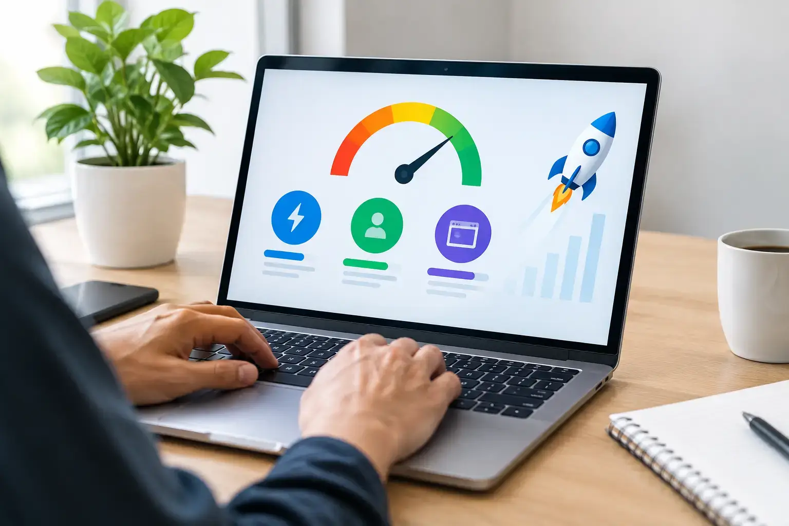
A slow site does more than frustrate visitors. It weakens confidence, especially when someone is about to provide payment details or send a business inquiry. Mobile visitors are particularly unforgiving when large images, sliders, scripts, and popups delay the first usable interaction.
Start with a performance audit rather than guessing. Measure page speed by page type: homepage, service page, category page, product page, cart, and checkout. A fast homepage does not compensate for a slow checkout.
The technical fixes depend on the stack, but the usual work includes image compression and modern formats, properly configured caching, a CDN, reduced third-party scripts, database cleanup, and optimized hosting. WooCommerce stores may also benefit from Redis object caching, careful plugin review, and separate handling for dynamic cart and account pages. Do not chase a perfect test score at the expense of functionality. Prioritize pages that generate leads and revenue.
6. Put proof next to the moment of doubt
Visitors hesitate because they are assessing risk. They want to know whether you are legitimate, whether the product will meet expectations, and whether support will exist if something goes wrong.
Place relevant proof close to the decision point. Service pages benefit from short case outcomes, client names where permission exists, credentials, process details, and transparent pricing signals. Product pages need accurate photos, specifications, stock status, customer reviews, returns information, and delivery expectations.
Generic testimonials placed at the bottom of a page have limited impact. A short testimonial about fast migration support is more convincing beside a migration inquiry form than beside an unrelated homepage section. The proof should answer the concern the customer has at that exact point.
7. Design for scanning, especially on mobile
Most visitors will not read a page line by line. They scan headings, buttons, prices, images, and the first sentence of each section. If the core message is buried under a large hero image or a long company introduction, the page makes conversion harder than it needs to be.
Use direct headings that state a benefit or answer a buyer question. Break dense information into short sections. Keep body text readable, buttons easy to tap, and important actions visible without excessive scrolling. On mobile, test sticky headers, cookie notices, chat widgets, and popups carefully. A feature that looks harmless on a large monitor can cover the purchase button on a phone.

Branding matters, but conversion-focused design is not decoration. It is visual hierarchy used to guide attention toward commercial decisions.
8. Track the full funnel, not just traffic
Traffic growth can hide a weak website. Ten thousand visitors mean little if you cannot see which channel produces inquiries, orders, qualified leads, or repeat customers.
Set up conversion tracking for the actions that matter: submitted forms, phone clicks, booked calls, add-to-cart events, checkout starts, completed purchases, and newsletter signups where email is part of the sales process. Segment performance by device, traffic source, landing page, and new versus returning visitor.
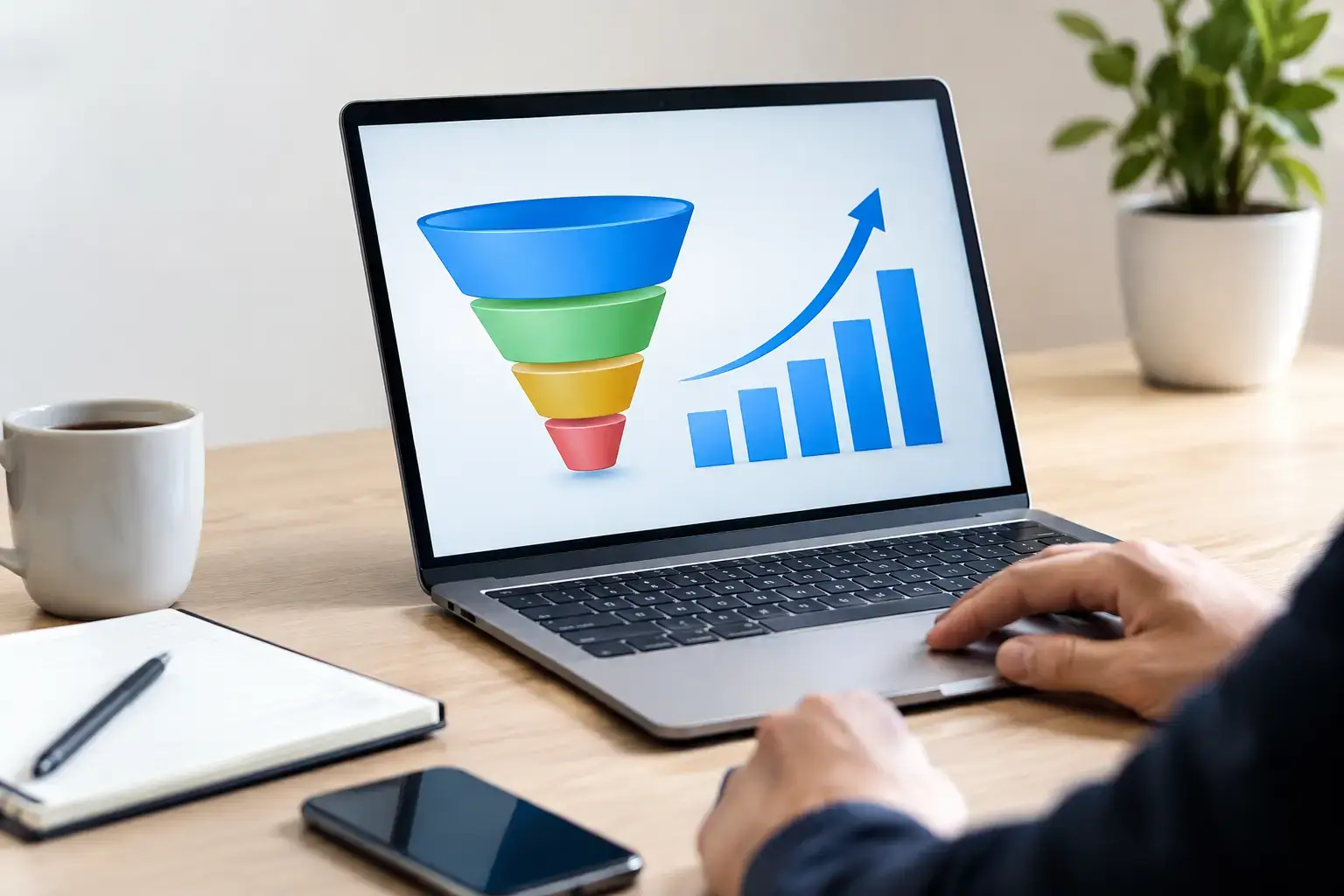
Then look for drop-offs. If people view products but rarely add them to cart, the issue may be pricing clarity, product information, or trust. If they add products but abandon checkout, investigate shipping costs, payment methods, account requirements, and technical errors. Analytics points to the problem area; session recordings, customer feedback, and checkout testing help explain why it is happening.
9. Test changes with a business hypothesis
Random redesigns are expensive and difficult to learn from. Instead, make a clear hypothesis: “Showing delivery dates on the product page will reduce checkout abandonment,” or “Replacing the general contact form with a project estimate form will increase qualified inquiries.”
Change one meaningful element or a tightly related group of elements, then measure it over enough traffic and time to avoid reacting to a few unusual days. Small businesses may not have enough volume for formal A/B tests on every page. In that case, use before-and-after comparisons alongside qualitative evidence, and avoid drawing strong conclusions from a handful of conversions.
Some improvements are nearly universal, such as fixing broken forms or reducing a five-second delay. Others depend on the buyer. Publishing prices may increase qualified leads for one service and deter conversations for another with highly variable scope. The right answer is the one that supports profitable, manageable sales for your business.
Improve website conversion rate one fix at a time
A higher conversion rate rarely comes from one dramatic redesign. It comes from resolving the small doubts and delays that sit between interest and action. Start with the pages closest to revenue, make the next step clearer, and keep improving based on what real customers do rather than what the team assumes they want.